It seems like almost every post I make, I talk about how I’m back at school working on finishing my Bachelor’s degree. The more classes I take, the more I realize why it’s such a benefit to actually go to school to learn this stuff. I’ve picked up my fair share by reading tutorials on the internet, but to spend 25 hours a week learning how to do it is completely different!
One of the coolest parts of my degree is all of the graphic design classes I get to take. For me, graphic design is a little bit like web designing in that I thought I knew what I was doing before but I’m learning tons and tons! I never in a million years thought I would be hand designing logos and critiquing other graphic design I come across.
I thought it would be fun to blog about some of it to show a little bit of the process. All of these are from my Beginning Graphic Design class that I took last semester.
Logo Project
This is the project I was the most proud of! It took 4 weeks and tons of hours to complete. Our assignment was to design a logo for a completely made up company or exhibit. I chose to do a company and it had to have an animal theme. My logo is supposed to be for a little boy’s clothing company.
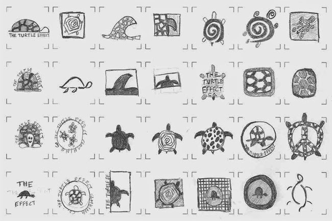
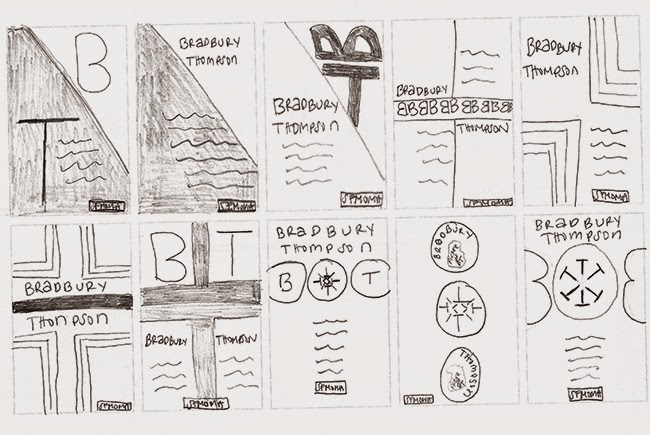
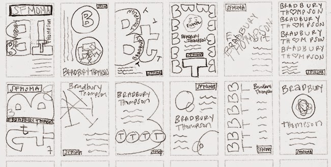
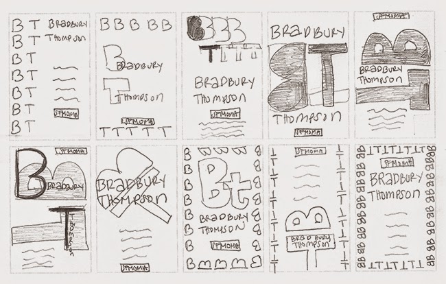
The first phase was drawing and re-drawing tons of thumbnails. This isn’t even all that I did! I usually feel like I’m not a very good artist but the whole point was to just brainstorm ideas.
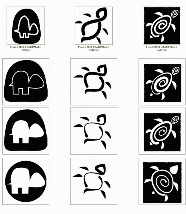
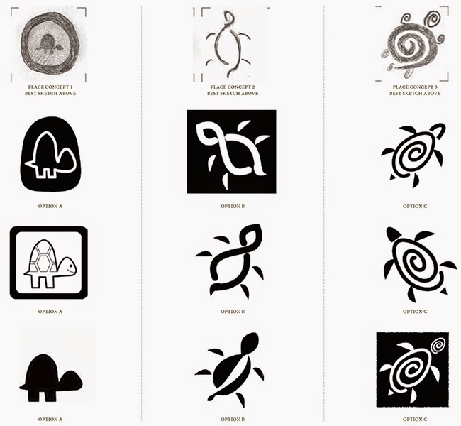
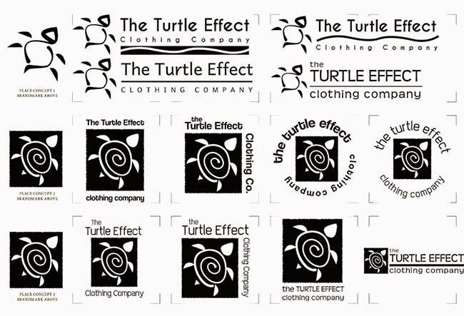
After getting some ideas down, we picked our favorites and made them digital in Adobe Illustrator. And when I say made them digital, I really mean that we had to build them from scratch in Illustrator.
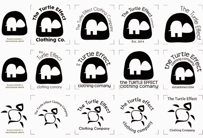
Then, add text and find a good font that would work.
Then, pick our favorite and add color. Lots of different colors to see which would look the best.
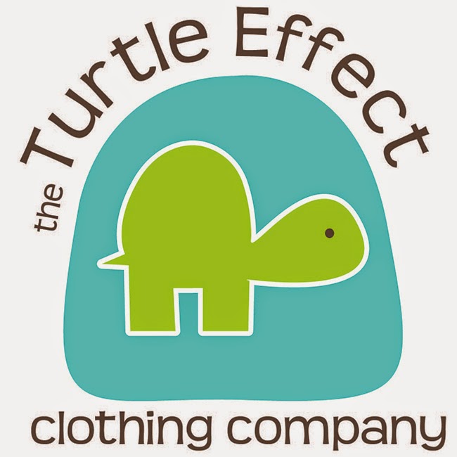
This was my final logo submission. I really love it! But truthfully, I really love a few of them. I’m so glad that ultimately I didn’t have to decide which to use for a real company!
It was an interesting learning experience because the idea I had at the beginning that I was sure was the best didn’t even get past the second phase. And even when I thought my brand mark was perfect, I still tweaked it all the way until the end. Overall, it was fun!
Poster Project
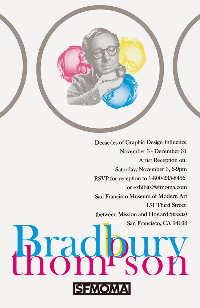
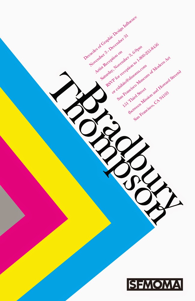
Another project we did was a poster project. It also took 4 weeks. We had to choose a 19th century artist and I chose Bradbury Thompson. I can’t believe that I didn’t know about him before. He had a tremendous influence on the graphic design industry with a career that spanned over 50 years! My posters were heavily influenced by his style.
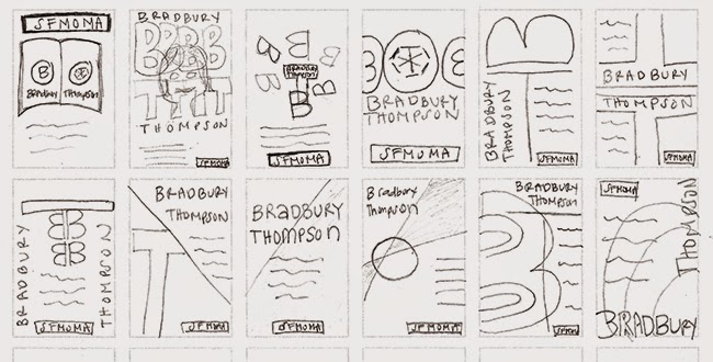
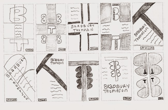
We had to turn in 3 different posters for a fake museum exhibit.
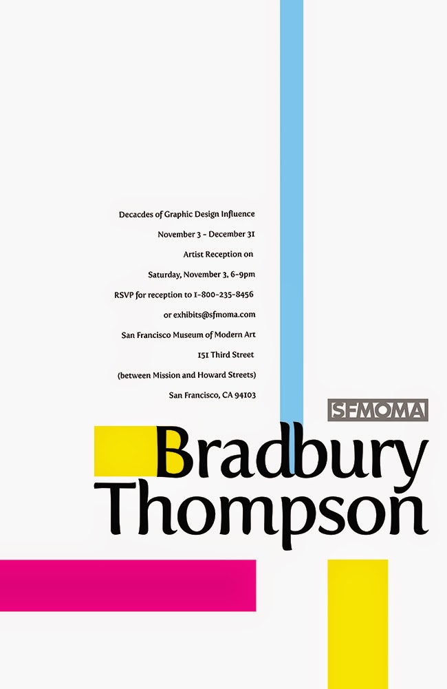
The first poster was based on the design principle of alignment:
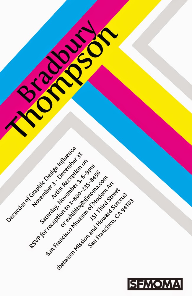
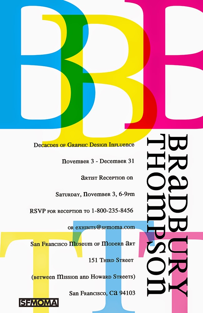
The second poster was supposed to be and artist perspective poser. It was designed how I envisioned that the artist would have designed the poster for himself. My favorite poster of the whole project was the second finished one (below on the right).
The last poster was designed using our own design style. I still based mine heavily on the style of the artist and part of the reason I did this was to make each poster fit in a set.
Anyway, kinda fun! This class was a TON of work – this is only half of the projects we did through the whole semester. I learned a tremendous amount!





Stephanie Haselrig says
I love everything you posted on this topic. I would love to take a graphic design class; however, I don’t have the time with 7 kids/ 4 still at home and a full time job. Thanks to you, I can live it through your post! Best of luck to you on this endeavor! I absolutely love seeing the transition of your logos from birth to a finished product. Bravo!